
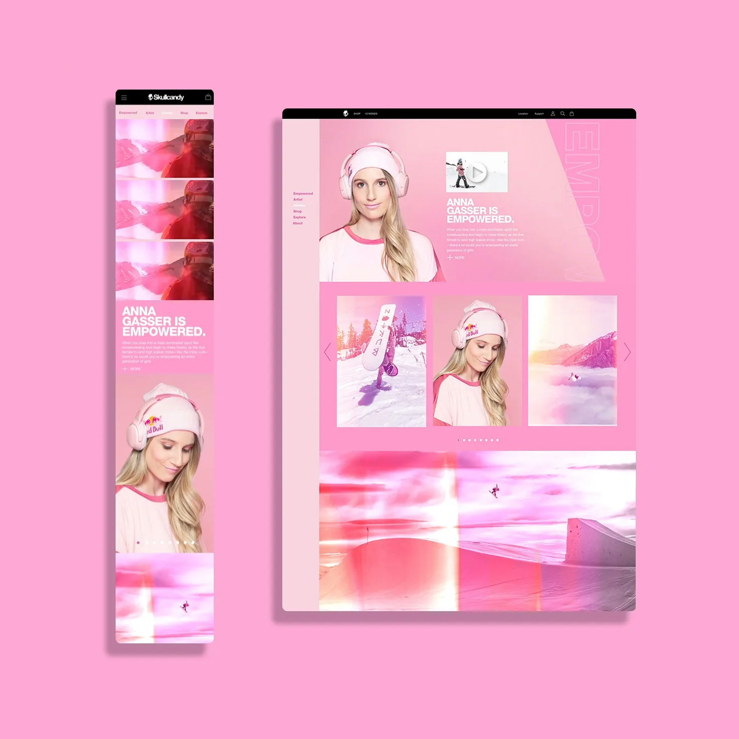
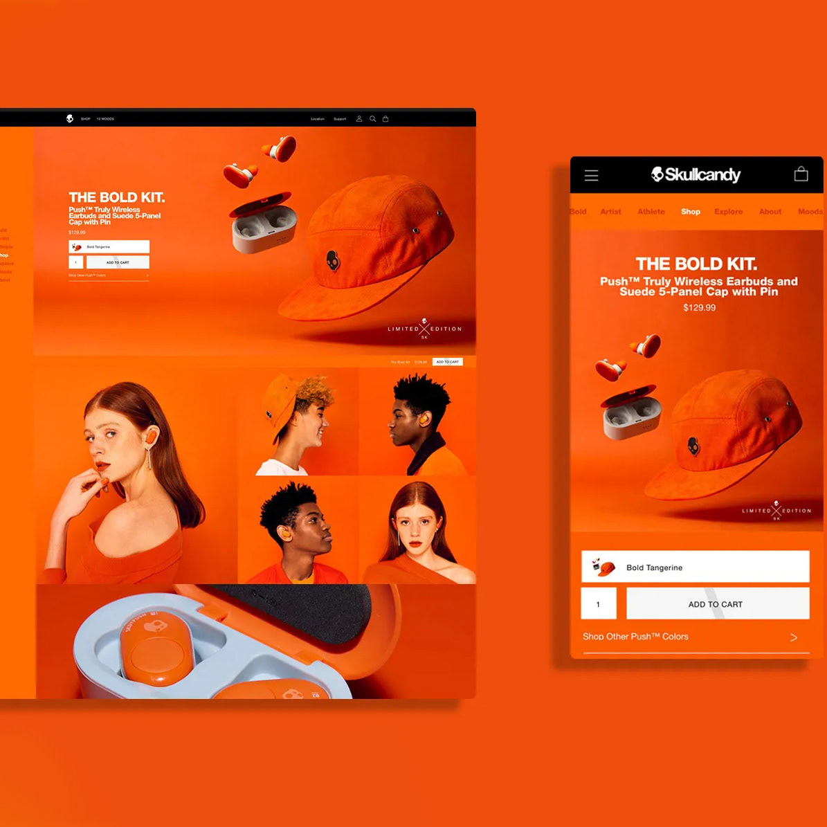
From headphones, earbuds to accessories this template provided flexibility to showcase content for the different product categories. When content didn't need to be displayed or for example when the app wasn't available in certain regions, these sections could condense down. The flexibility of this template allowed us to release content on our site, capture pre-orders and even bundle with other products for a discount. With continued testing we were able to optimize the page with image compression and lazy loading to decrease page load time and lower lighthouse scores. We also found that by condensing the reviews section and reordering frequently asked questions increased conversion in the US.
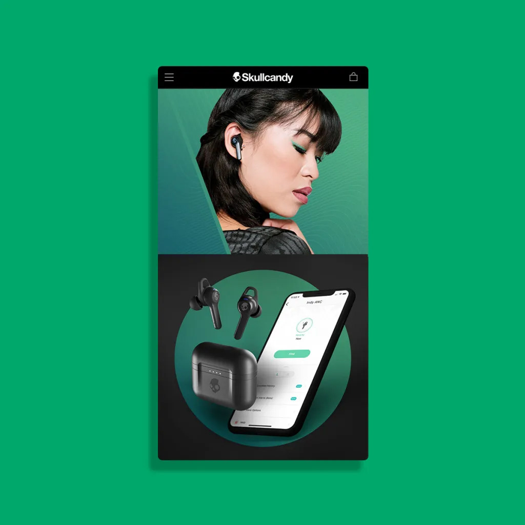
However you view this product detail page, it is designed with mobile first in mind and is responsive across all breakpoints. The UI patterns that were introduced on this page were built for flexibility across the site and could easily be updated with new content by our in-house authors.
The mobile first approach allowed us to create a visual hierarchy that allowed us to tell a product story that unfolded to a more robust and detailed experience on desktop. It not only allowed us to align from a strategic business perspective but made sure our marketing efforts were prioritized by product feature. For instance if a product was built for working out, or promoted for its excellent bass the way the page was laid out helped elevate that experience with visuals and animations that reinforced the product feature with the primary feature first, then secondary etc as you scrolled.
To increase engagement and drive conversion a sticky navigation was introduced that allowed the user to select color ways, pre-order and buy. Adding subtle animations on scroll, and drawers that unfolded more detailed content allowed us to tell more detailed partner integrations or details about a technical feature such as Tile, Supreme Sound and how to control your earbuds with the App.

